INDUSTRY:

Consumer Services

CLIENT:

LEAFHOME: INNOVATIVE HOME SOLUTIONS

YEAR:

2024

EXPERIENCE:

Ux Case Study
Cover

Field Service App

about.
Before we talk about the solution, you need to feel the problem. This is what a regular workday looked like for the people we were designing for.

A field agent's morning: It's 9am in Cleveland. Marcus has four installation jobs today. He opens his field app and it's crashed — Salesforce pushed an update overnight. He calls his manager. Third time this week. He doesn't know if the right materials will be at the first job. If they're not, the whole day shifts. Whatever he records in the app today, his manager will manually retype into Salesforce tonight. The paper Certificate of Completion Marcus needs the customer to sign? He'll photograph it and WhatsApp it to the office. This was not an edge case. This was every field agent, every day.

(Observed during field visit, Cleveland, Ohio · August 2024)


PROJECT OVERVIEW.


The Client
LeafHome — a leading US home solutions company specialising in gutter protection, water filtration, stair lifts, and bath solutions. Field-first business with hundreds of agents across North America.
The Initiative
Project Bloom — a full platform migration from fragmented legacy tools to a unified Salesforce + NetSuite ecosystem. Our custom field web app was the frontline of that transformation.
Platform
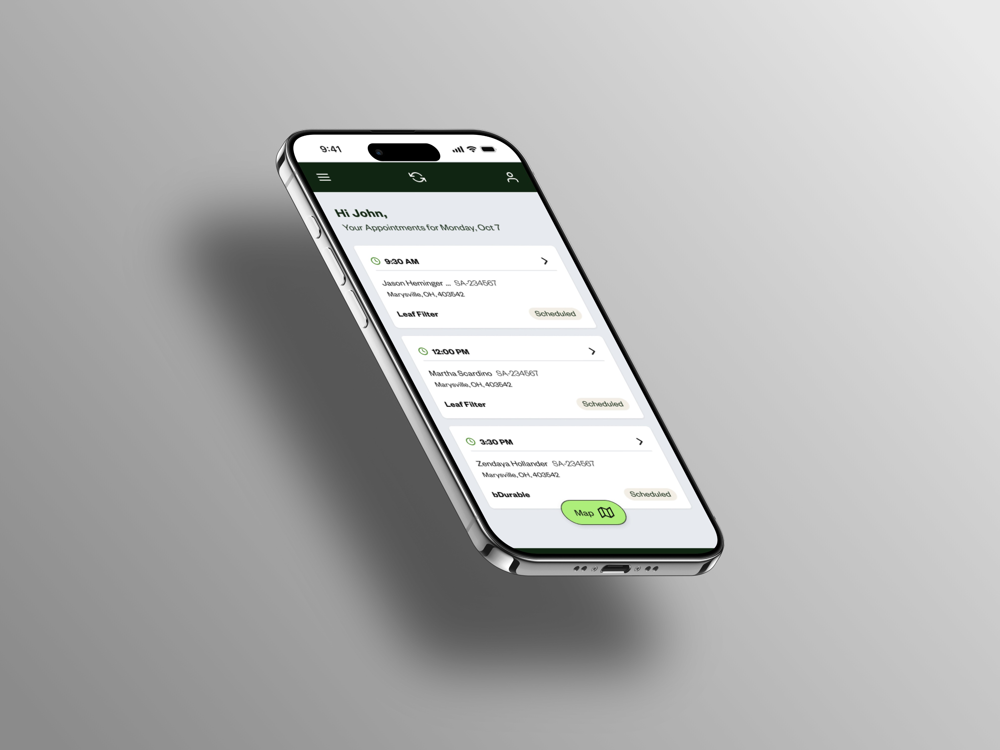
A responsive browser-based app (Chrome/Safari on phone and tablet) — no native install, accessible from any device a field agent already carries.
Research Scope
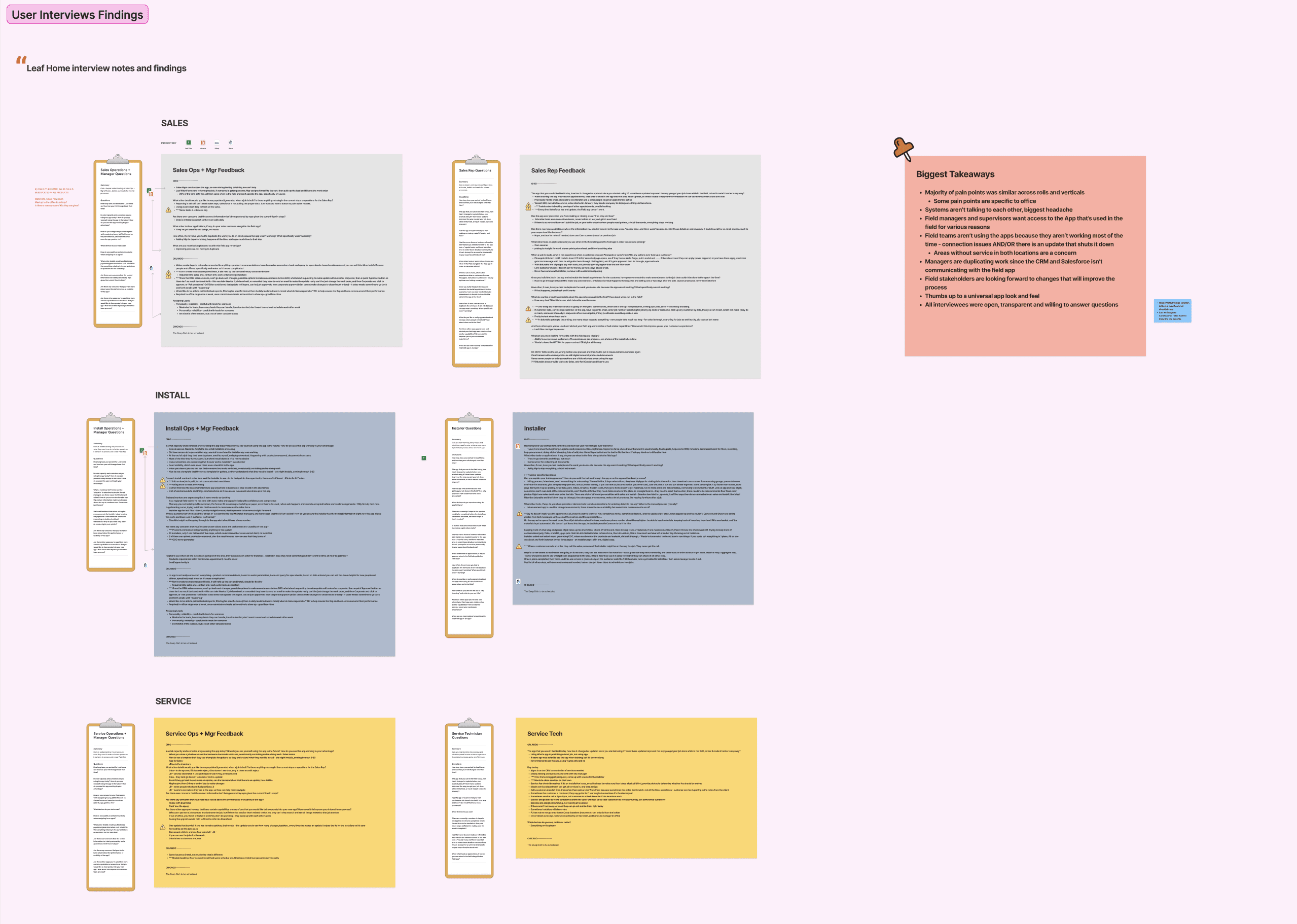
In-person field visits and Zoom interviews across Cleveland, Ohio · Orlando, Florida · Chicago, Illinois — chosen to capture geographic and role diversity across the field org.


DESIGN PROCESS.


Discover
Define
Ideate
Design
Handoff
User research - Field visits(1-1) interviews/ zoom calls
Week 1-2
Persona mapping
Week 3
User Journeys
Week 4


Design systems/ Final visual designs
Week 5
Dev handoffs
Week 6


MY CONTRIBUTIONS.


🔍 User Research
🗺️ Journey Mapping & Synthesis
🖌️ Design
🤝 Stakeholder Alignment
🚀 Dev Handoff
Led field visits across Cleveland, Orlando & Chicago. Ran contextual inquiry sessions with all 3 user roles — in person, not just Zoom.
Facilitated synthesis workshops post-research. Created 3 distinct end-to-end journey maps, surfacing friction clusters that directly drove design decisions.
Owned all wireframes across both phases. Iterated based on internal reviews and stakeholder feedback
Presented design decisions weekly to LeafHome's product team. Advocated for user needs when business asks conflicted — and documented the trade-offs made.
Prepared full annotation specs and Figma handoff files for Salesforce/NetSuite engineering integration. Stayed involved through launch.


Showcase image
Showcase image
challenge.
QUALITATIVE RESEARCH.


  • In person observations + zoom calls with field agents across all 3 cities - Cleveland, Orlando and Chicago

ASSUMPTION → FINDING → DECISION → OUTCOME


What we assumed
Research showed
Decision
01
The primary pain was the old app's poor UI — users just needed a cleaner, faster interface to do the same things.
The UI was almost irrelevant. The real pain was forced double data entry — every record typed in the field had to be retyped in the office. This single finding changed the entire project direction.
Real-time Salesforce sync. Single data entry point in the field. Whatever an agent records auto-syncs to the work order — no re-entry, no reconciliation.
02
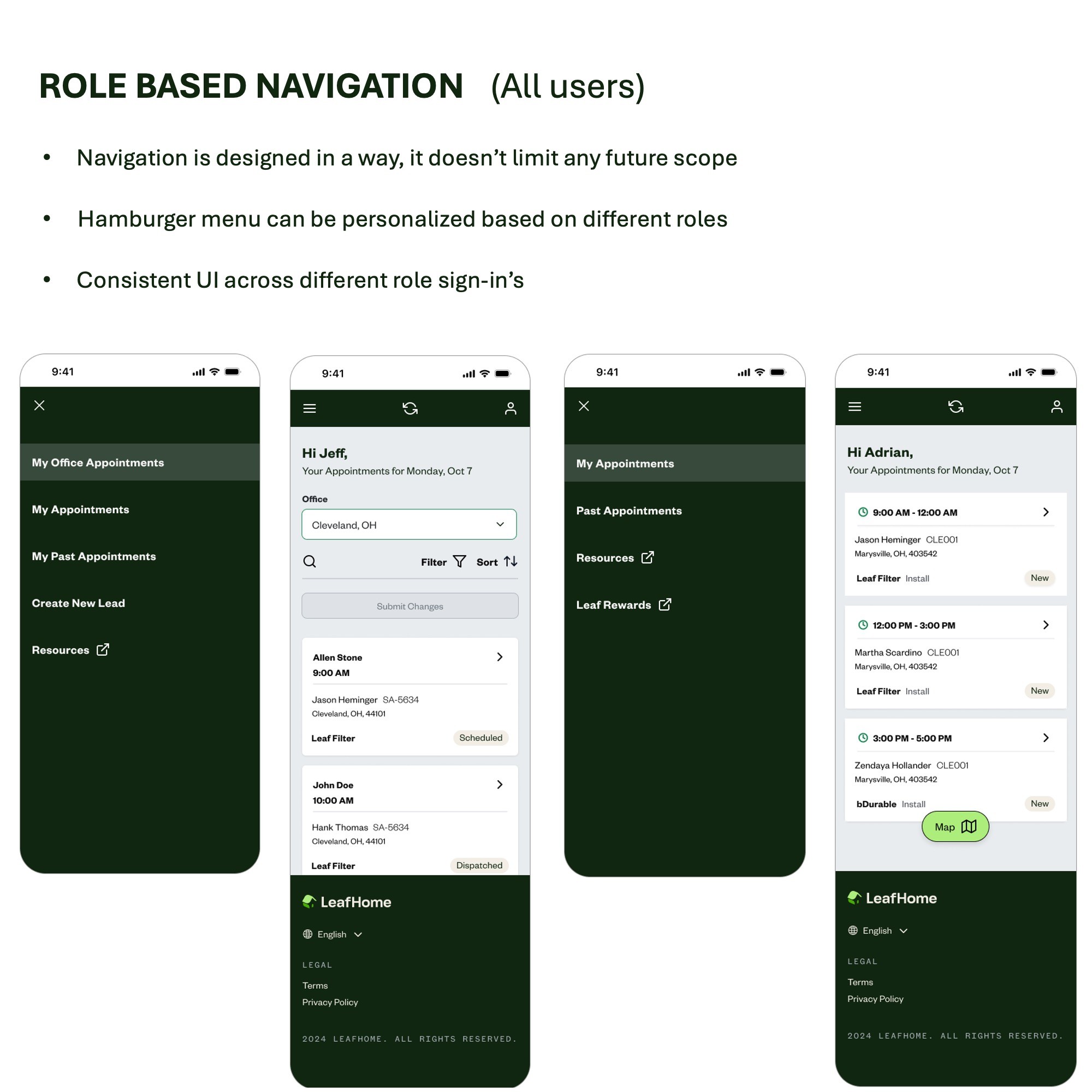
All three user roles had completely different workflows — hence different navigation is required based on user roles.
All three user roles had similar workflows. A Sales Rep's job ends at signature. An Installer's starts there. A Technician's might loop back through escalation. One nav would have served none of them.
Role-based navigation at login. Each user lands on a landing page which displays the list of jobs for the day — work orders for reps, installers and service tickets for technicians. Hamburger menu adapts for dual-role users.
03
Document handling (photos, COCs, agreements) was a minor friction point — primarily a formatting issue.
The biggest source of data loss and trust breakdown in the org. Agents used personal WhatsApp for photos, paper for COCs, email for agreements — all outside the system. A technician in Orlando showed us a WhatsApp folder of job photos going back 6 months.
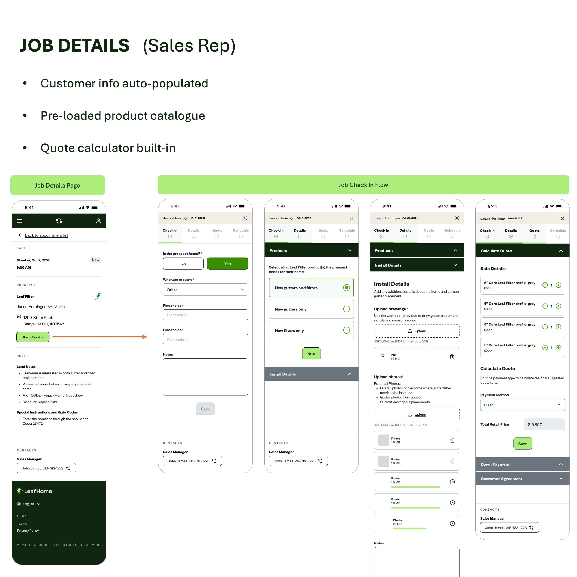
In-app document handling built into the job flow. E-signature, photo upload, and COC sign-off at the point of task — not as a separate step. Documents auto-attach to the Salesforce work order record.


USER PERSONAS — 3 DISTINCT MENTAL MODELS


Sales Representative 💼
Installer 🛠️
Service Technician ⚙️
Sell today. Build trust. Close the deal and schedule installation before leaving the driveway.
Core Needs:
  • Commission visibility in real-time
  • On-site quote generation
Arrive with the right materials. Install correctly. Leave with a signed COC and collected payment.
Core Needs:
  • Accurate work order with materials list
  • One-tap navigation to job site
  • In-app photo upload and COC sign-off
Diagnose. Repair if possible. Escalate if not. Always document before and after.
Core Needs
  • Work order details at a glance
  • In-app supervisor escalation
  • Fee waiver decision support
"I need to see my commission right now. I have no idea where I stand until end of month."
"The materials listed are often wrong. I arrive and I'm missing parts. The whole day shifts."
"If I can't fix it, I need the Install Manager. But there's no way to do that inside the app."


REAL-WORLD COMPLEXITY — THE EDGE CASE THAT MATTERED
During stakeholder sessions, we discovered that a subset of Sales Reps also held a Sales Manager role — they managed dispatch for the wider team while still personally attending appointments. This meant they needed two completely different views of the same system: their own appointment queue as a rep, and a dispatch view showing the full team's assignments as a manager. A single-mode nav would have forced constant context-switching, or worse, required two separate logins.


The Design Decision
Why This Mattered
We built a hamburger menu that adapts based on role combination at login. For dual-role users, both the personal appointment view and the dispatch/office view are accessible without re-authentication. The navigation architecture was designed to accommodate future role expansions without requiring a structural redesign.
This is the kind of complexity that gets discovered in the field, not in a requirements document. If we had built purely from the initial brief — three personas, three flows — we would have shipped a product that didn't work for an entire subset of our users from day one. The field visit to Cleveland surfaced this on day three of research.


WHEN A STAKEHOLDER COMMENT CHANGES THE DESIGN
How split payment went from invisible to shipped (Stakeholder Review · Week 5)


01
The original design
The payment screen we presented had been designed around the assumption that a customer pays via one method — Cash, Check, Credit, or ACH. Single selection, straightforward flow. It matched the brief and no one had flagged it as a problem.
02
The moment that changed it
During the stakeholder review, a Sales Manager mentioned offhand: "Sometimes customers want to put part of it on a card and pay the rest in cash — that happens more than you'd think." It wasn't a complaint or a formal requirement. It was a passing comment. We stopped and asked how often. The room confirmed it was regular — particularly for larger installations where customers were managing budgets.
03
What that meant for the design
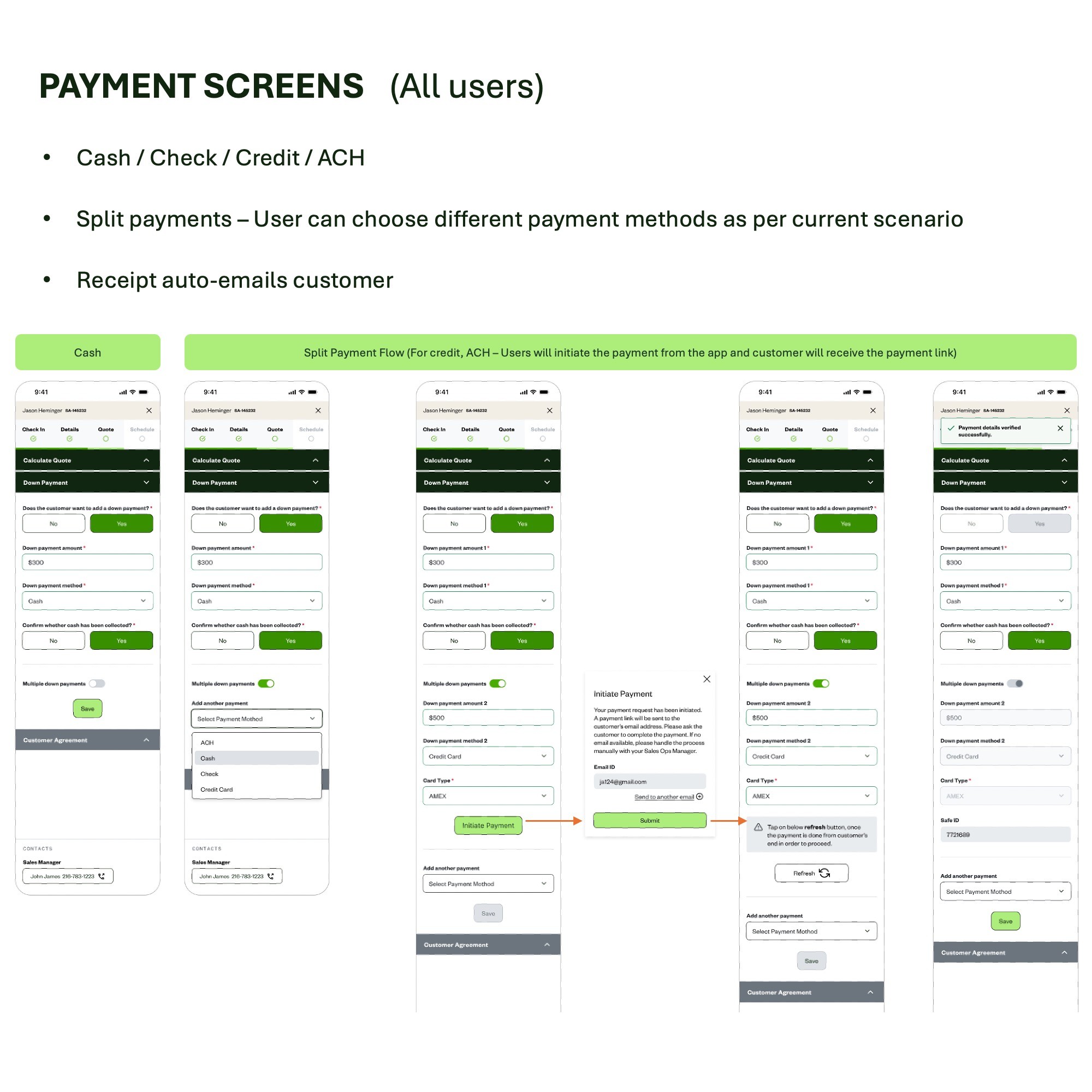
A single-selection payment screen would silently fail these customers. The agent would either have to abandon the in-app flow, or tell the customer they couldn't split — potentially losing the sale. Neither was acceptable. The original design had no way to handle this and it wasn't on the roadmap.
04
The decision and the advocacy
We took this back to the team, made the case that a split payment flow was a core requirement — not a nice-to-have — and redesigned the screen to support multiple methods in a single transaction. The business approved it. Cash, Check, Credit, ACH, and Finance unified in one screen. Split payment supported with a live running total that validates before submission.


Showcase image
Showcase image
Showcase image
Showcase image
results.
Measured 2 months after go-live, June 2025. These numbers represent real field agents doing their jobs differently — and better.


+125%

+77%

+73%

Sales Rep Adoption
40 → 90 active users
Technician Adoption
30 → 53 active users
Platform Engagement
Appointment updates up across board


BEFORE VS. AFTER


Metric
Before Launch
After Launch (2 months)
Sales Rep active users
40
90
Sales Rep appointment updates
750/period
1,297/period
Installer / Tech active users
30
53
Installer appointment updates
149/period
260/period
Data entry method
App + manual CRM re-entry
Single system, auto-sync
Document handling
Paper / WhatsApp / email
In-app job photos/coc upload


MY BIGGEST TAKEAWAY 📈


  • B2B enterprise UX is about reducing friction for people doing physically demanding work. Every extra tap, every re-entry, every app crash has a real human cost — not just a usability score.


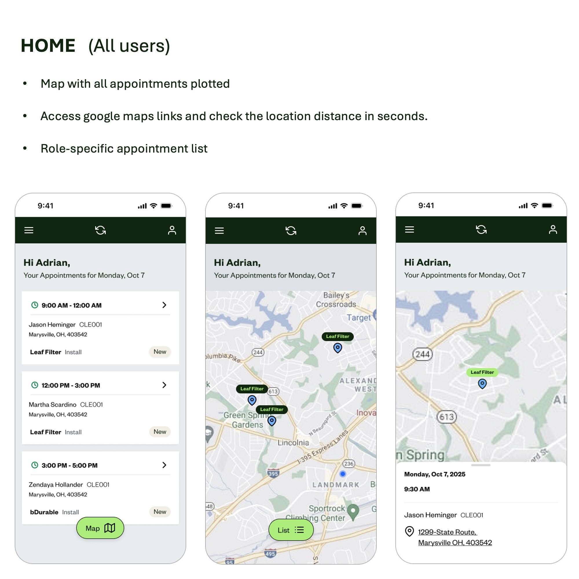
  • Design decisions that feel small — like integrating map on the homepage to let field agents know how far the customers locations are and plan the trip for the day accordingly and do their job more efficiently.


  • Going into the field changes what you're solving for. We started this project thinking we were fixing software. We ended it knowing we were fixing a broken information chain that touched every person in the organisation.

Showcase image